Color is always the first thing anyone notices about a flower arrangement. Before they register the shape, the texture, or even the variety of blooms, they react to the palette.
And that reaction happens fast — almost instantly. So getting color right isn't just about personal taste. It's the difference between an arrangement that stops people in their tracks and one that just sits there looking like a bunch of flowers stuck in a vase.
Start With the Color Wheel
Every solid color decision in floristry starts with understanding how colors relate to each other. The color wheel divides into primary colors — red, blue, and yellow — secondary colors formed by mixing two primaries, like orange, green, and purple, and tertiary colors that result from combining a primary with a secondary. These relationships define which colors harmonize and which clash. The closer two colors sit on the wheel, the more naturally they flow together. The farther apart they are, the more visual tension — and potential drama — they create.
The 7 Color Schemes Worth Knowing
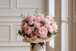
Analogous color schemes are probably the most forgiving and naturally beautiful option — grouping three or four colors that sit beside each other on the color wheel. Think coral, peach, and soft yellow, or violet, lavender, and dusty rose. The trick with analogous palettes is to vary the value: pick a light tone, a midtone, and a darker version of the same color family, and the arrangement almost designs itself.
Complementary colors sit directly opposite each other on the wheel — blue and orange, yellow and purple, red and green. These pairings create high contrast and visual excitement, but they work best when at least one of the two colors is softer or more muted. A faded blue delphinium against peachy ranunculus is far more sophisticated than a pure cobalt next to a neon orange. When both colors are at full saturation, the result can feel aggressive rather than dynamic.
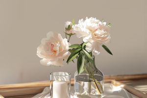
Monochromatic arrangements use only one color in varying shades and textures. An all-white bouquet incorporating roses, lisianthus, and spray flowers in slightly different tones of white and cream achieves something genuinely elegant. The variations in texture and shape carry all the visual interest, so the eye doesn't get bored. It's also one of the easiest palettes for beginners to nail.
Rainbow or polychromatic arrangements incorporate the full color spectrum. They're chaotic in the best way when done with softer, more pastel tones — pastels from different parts of the wheel play together far more peacefully than saturated brights.
Ombre or gradient designs move smoothly from one color to another — from deep burgundy through red into orange, for instance. This transition creates movement and works especially well in larger installations.
Triadic schemes use three colors evenly spaced on the wheel, like red, yellow, and blue. They're balanced and vibrant but can feel harder to pull off naturally without looking artificial.
Accent color designs build around a dominant palette and then introduce one unexpected pop. A bunch of deep, moody blooms in burgundy and plum becomes something completely different the moment one blush dahlia appears front and center.
Warm vs. Cool — and Why Temperature Matters
Every color has an undertone that leans either warm or cool. A warm pink has yellow undertones and will feel sunny and peachy. A cool pink leans blue and will feel crisp and romantic. These two versions of "pink" can look genuinely jarring next to each other, even though they're technically the same hue. Checking the temperature of each flower before combining them is one of those habits that separates confident designers from beginners who can't quite explain why a palette isn't working.
Neutrals Are Not Optional
Greenery, cream tones, and soft whites aren't fillers — they're the structural support of a well-designed palette. They give the eye somewhere to rest between bolder blooms. When a saturated focal flower like hot pink is paired directly with a pure white filler, the white can feel too stark. Reaching for blush or a creamy ivory instead softens the gap between them and keeps the arrangement cohesive. Neutrals also let you use more colors in the same design without things tipping into chaos.
Great floral color combinations are not about using the brightest flowers, but about balance, harmony, and understanding how colors interact. With the right palette, even simple arrangements can feel artistic and memorable.