If you've ever found yourself dreaming of a chic, serene, and sophisticated living room, the answer might lie in the subtle beauty of Morandi colors.
Named after the renowned Italian painter Giorgio Morandi, this palette is known for its muted, soft tones that evoke elegance and tranquility without overwhelming the senses.
But how can you incorporate this soothing color scheme into your living room without it feeling cold or oppressive? The key is understanding color psychology, balancing the right hues, and using them strategically to brighten and soften your space.
1. Understanding Morandi Colors
Morandi colors are a harmonious blend of muted pastels and earthy tones, leaning heavily on shades of gray, beige, soft blues, and dusty pinks. The palette's soft, understated quality makes it versatile in various interior designs, especially when you want a refined yet calm atmosphere. These colors are far from dull; instead, they invite a sense of peaceful sophistication.
The Palette's Subtlety
Unlike traditional vibrant colors, Morandi's muted tones make the space feel warmer and more inviting. Think of these hues as a gentle breeze, perfect for creating a relaxed, stress-free environment. These colors are subtle, never overwhelming, making them ideal for a living room that you want to feel peaceful and refined.
Why Gray? The Heart of the Palette
Gray, particularly its lighter and warmer shades, is the foundation of the Morandi color palette. It offers a neutral base that allows the other colors to shine without dominating the space. When used correctly, gray can balance out brighter colors while still adding sophistication. This makes it an ideal choice for modern interiors that need a touch of warmth without sacrificing style.
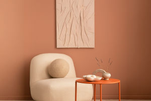
2. Color Proportions: The 6:3:1 Rule
One of the secrets to a successful Morandi-inspired living room is knowing how to balance the colors. The 6:3:1 principle is a simple yet effective guideline for color distribution. This rule helps create a sense of balance while ensuring that no color dominates the space.
Applying the 6:3:1 Rule
• The dominant color (usually a soft, neutral gray or beige) should occupy about 60% of the room. This color will cover the majority of your walls, larger furniture pieces, or flooring, establishing the room's overall tone.
• The secondary color (often a soft pastel or muted tone like dusty pink or pale blue) should make up about 30% of the room. This can be used for accent walls, throw pillows, or smaller furniture pieces.
• The accent color, typically a more vivid or contrasting shade like deep navy or burnt orange, should be used sparingly—around 10%. Accent colors are best for small details, such as artwork, lamps, or decor.
Maintaining Harmony
When you stick to this proportion, the room feels naturally balanced and calming. The dominant gray or beige allows the softer accents to shine, while the contrasting color adds depth without overwhelming the space. This creates a harmonious environment that feels sophisticated yet not cold or sterile.
3. How Gray Affects Lighting and Mood
Gray is often considered a “cool” color, which can sometimes make a space feel a bit distant or chilly. However, when paired with the right amount of light and warmth, gray can enhance the ambiance of your living room, making it feel inviting and cozy.
The Role of Natural Light
In a room with ample natural light, gray can create a serene, airy atmosphere. It reflects light, preventing the space from feeling too dark or gloomy. However, in rooms with limited sunlight, gray tones may absorb light, so it's crucial to balance them with lighter accents or warmer hues like cream or soft peach to maintain a welcoming feel.
Artificial Lighting Tips
When it comes to artificial lighting, opt for warm, soft lighting rather than stark white lights. Warm-toned light bulbs will complement gray tones and prevent the room from feeling too cold. Consider adding floor lamps or table lamps with warm light to create layers of light, adding warmth and depth to the space.
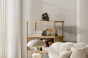
4. Adding Texture to Enhance Morandi Colors
Incorporating different textures is essential when designing a room with Morandi colors. The subtle tones might risk making the space feel flat or dull if you don't add depth through texture. Textures bring life to the room and can soften the gray tones, giving the room a more inviting and dynamic atmosphere.
Soft Fabrics
Textiles play a huge role in creating a cozy, lived-in feeling. Incorporate soft fabrics like velvet cushions, wool throws, or linen curtains to add warmth and comfort to your living room. These fabrics not only enhance the visual appeal of your space but also introduce an element of tactile pleasure.
Natural Elements
Bring in natural textures, such as wooden furniture, stone accents, or indoor plants. These organic elements create a lovely contrast with the cool tones of gray and add an earthy, grounded quality to the room.
5. Avoiding an Overwhelming Gray Room
While Morandi colors are calming and sophisticated, it's important to strike the right balance. A room filled with too much gray can feel heavy and uninspiring, particularly if there's little contrast or warmth in the space. To avoid a room that feels depressing, focus on incorporating other hues and textures that break up the gray, adding interest and contrast.
Add Pops of Color
While Morandi colors are understated, small pops of vibrant color can make a significant impact. A bold piece of artwork, a colorful rug, or even a plant with bright green foliage can add energy to the space without overwhelming the calming tones of the gray.
Mix with Other Neutral Tones
Don't be afraid to mix grays with other neutral tones, such as beige, white, or soft pastels. This helps create a dynamic space while maintaining the overall serene aesthetic. By playing with the mix of light and dark, soft and bold, you can avoid creating a monotonous or flat room.
Final Thoughts: Creating Tranquility through Color
Using Morandi colors in your living room design can transform your space into a peaceful sanctuary, offering a refined and calming ambiance. By applying the right balance of colors, textures, and lighting, you can achieve an elegant room that feels both cozy and sophisticated. When designing with these subtle, muted hues, remember that less is more—by following the 6:3:1 principle and playing with textures, you'll create a space that invites relaxation and beauty.
As you experiment with the colors in your living room, take time to observe how each change affects the overall mood of the space. Ultimately, your home should be a place of comfort and tranquility, and with the right color palette, it's easier than you think to create a harmonious, inviting environment.