Entering a large, open room, one might feel both impressed and slightly disoriented. Without clear boundaries, the eye wanders across the space, unsure where one area ends and another begins.
Color and texture are powerful tools that interior designers use to define zones, create visual interest, and guide movement through a space.
In modern interiors, thoughtful use of these elements can make even an expansive room feel coherent, inviting, and functional.
Color and texture are more than decorative choices—they communicate mood, emphasize function, and influence perception of size and depth. When applied strategically, they allow different areas within a single space to stand out while maintaining overall harmony.
Using Color to Differentiate Zones
Contrasting tones for separation
Distinct color palettes can subtly indicate functional zones. For example, a warm ochre accent wall in a dining area contrasted with soft gray in a living space instantly distinguishes the two zones. This approach guides the eye and provides visual cues without erecting physical barriers.
Coordinated palettes for cohesion
Even when using contrasting colors, maintaining a shared base palette ensures cohesion. Incorporating common neutral tones across different zones allows each area to feel distinct while remaining part of a unified design.
Accent colors for focus
Strategic use of accent colors draws attention to focal points such as artwork, furniture, or architectural features. In an open-plan living space, a bold-colored chair or textured rug can anchor a seating area without overwhelming surrounding zones.
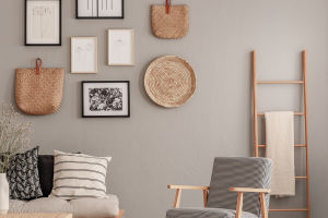
Incorporating Texture for Depth
Layering materials
Combining different textures—smooth wood, soft textiles, rough stone, or metallic finishes—adds depth and tactile interest. A textured wall behind a sofa, paired with plush cushions and a sleek coffee table, creates a multi-sensory experience that distinguishes the living area from the dining zone.
Rugs and flooring changes
Varying flooring materials or adding rugs helps define specific areas within a larger room. A patterned rug under a dining table or a natural-fiber mat in a reading nook not only provides comfort but also delineates functional zones through subtle visual boundaries.
Soft versus hard surfaces
Contrasting soft and hard textures can guide perception of space. Upholstered furniture, drapes, and cushions create intimacy in living areas, while polished concrete or wood floors in open corridors convey expansiveness and movement.
Balancing Color and Texture
Avoiding visual overload
While color and texture are powerful, too many competing elements can overwhelm the eye. Limiting the number of dominant hues and repeating textures selectively ensures a balanced and coherent look.
Strategic repetition
Repeating certain colors or textures across zones ties the space together. A single metallic accent used in lighting, picture frames, and tableware subtly connects areas without making them feel uniform or monotonous.
Natural light and perception
Lighting dramatically affects how color and texture are perceived. Sunlight enhances the vibrancy of colors and highlights surface textures, while artificial lighting can be used to adjust mood and emphasize focal points in different zones.
Using color and texture thoughtfully transforms open or multifunctional spaces into areas that feel purposeful and harmonious. They provide visual hierarchy, guide movement, and create a sense of intimacy without needing walls or partitions.
When walking through a well-designed modern interior, one notices how subtle shifts in hue or texture indicate the transition from one zone to another. The eye naturally moves from area to area, and the space feels both dynamic and cohesive.
By understanding the interplay between color, texture, and function, homeowners and designers can craft interiors that are visually engaging, comfortable, and intuitively organized, making every corner of a room feel intentional and inviting.