Color is the unsung hero of home decor. It can change the atmosphere of a room, evoke emotions, and even affect how we feel in a space.
When it comes to soft furnishings—like cushions, rugs, curtains, and throws—getting the right color balance is crucial for creating a cohesive and inviting environment.
Whether you're going for a vibrant, energetic look or a more muted, calming vibe, color can be your greatest tool.
In this guide, we'll explore the essential rules for color coordination in soft furnishings to help you transform your space into a beautifully balanced haven.
Understanding the Power of Color
Before diving into the specific rules for color matching, it's important to understand how color impacts a room. Colors can influence the mood of a space, how large or small a room feels, and even how comfortable we feel in that environment.
• Warm Colors (Red, Orange, Yellow): These colors energize a space, making it feel more inviting and dynamic. They're perfect for creating warmth in living rooms or kitchens where socializing and energy are key.
• Cool Colors (Blue, Green, Purple): These hues have a calming, soothing effect. They are ideal for bedrooms and bathrooms, where relaxation is the priority.
• Neutrals (White, Beige, Gray, Black): Neutral colors provide a balanced backdrop that can work with virtually any style. They help other colors pop and offer a sense of sophistication.
Now that we understand the power of color, let's dive into specific guidelines for using it effectively in soft furnishings.
The 60-30-10 Rule: Achieve Harmony in Your Color Palette
One of the most fundamental principles of color coordination is the 60-30-10 rule, a strategy used by interior designers to ensure a balanced and aesthetically pleasing space. This simple rule can help you determine how much of each color to use in a room.
1. 60% Dominant Color: The primary color of the room. This usually covers the largest surface area and provides the room's overall tone. For example, in a living room, the walls and large pieces of furniture (like the sofa) are typically the dominant color. Choose a neutral or a soft hue for this, depending on the desired mood.
2. 30% Secondary Color: This color complements the dominant color and provides a bit more contrast. In soft furnishings, this could be the fabric of the curtains, smaller furniture pieces, or accent walls. It should work harmoniously with the primary color, either by contrasting or blending subtly.
3. 10% Accent Color: The accent color is the smallest but most striking part of the design. It's often used in smaller accessories like cushions, rugs, throws, and art pieces. This is your chance to add a pop of color that brings life to the room. For instance, a red or yellow throw could liven up a neutral-toned sofa.
This rule helps maintain balance while adding depth and interest to your decor. A simple, effective strategy to achieve visual harmony without overwhelming the space.
Complementary vs. Analogous Color Schemes
Once you've got a general color structure in place, you can refine your color choices by focusing on complementary or analogous color schemes.
1. Complementary Colors: These are colors that are opposite each other on the color wheel. Think blue and orange, red and green, or yellow and purple. Complementary colors create a high contrast and vibrant look, ideal for more energetic spaces. However, be cautious when applying them—too much contrast can feel chaotic. A few small pieces in complementary colors can add excitement without overwhelming the room.
Example: A navy blue couch with mustard yellow cushions. The contrast is strong, yet they work well together when used sparingly.
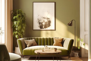
2. Analogous Colors: These colors sit next to each other on the color wheel, creating a harmonious and serene look. For a more calming atmosphere, opt for an analogous color scheme, such as blue, teal, and green, or soft yellows, oranges, and reds.
Example: Soft green curtains paired with cream-colored cushions and pale green throws. The result is a relaxing, seamless flow that feels effortless.
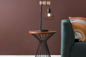
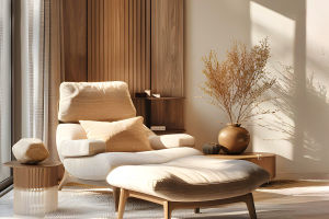
Using Neutrals as a Foundation
Neutral tones are the backbone of many successful color schemes. They're timeless, versatile, and provide the perfect base for adding pops of color through your soft furnishings. Neutral tones also allow you to play with texture and patterns without the color being overwhelming.
• Textures: Mix different textures (such as velvet, linen, or cotton) to add depth without introducing more colors. A neutral gray couch with a velvet cushion in a soft blush pink can feel luxurious yet soothing.
• Patterns: Incorporate patterns through your cushions, rugs, and throws to add interest to a neutral palette. Stripes, geometric shapes, and floral prints can all work beautifully in neutral spaces as long as the color palette stays cohesive.
Neutrals give you the flexibility to rotate accent colors and change your look seasonally or according to your mood.
Seasonal Color Adjustments
Color schemes are also influenced by the seasons. The changing environment outside can provide inspiration for adjusting your indoor color palette. For example:
• Spring and Summer: Opt for lighter, airier hues like pastel pinks, soft greens, and sky blues. Think about incorporating fresh, nature-inspired colors that evoke a sense of renewal.
• Fall and Winter: During the cooler months, deeper, richer tones such as rust, mustard, and emerald green can help create a warm, cozy atmosphere. Introducing deeper tones can balance out the often grayer outdoor environment and make your space feel inviting.
Don't Be Afraid to Experiment with Bold Colors
While it's easy to rely on neutrals and subdued tones, don't be afraid to experiment with bolder, unexpected color choices. Soft furnishings are an excellent way to introduce bright hues without overwhelming your space. Consider incorporating a bold statement piece, like a vivid red throw or a teal rug, into a more neutral room.
Experimenting with colors also means understanding the psychology of color—red stimulates energy and passion, while blues calm and soothe. Consider how you want to feel in a given space before choosing these more intense colors. A bold-colored cushion or blanket can change the room's mood and help it feel uniquely your own.
Conclusion: Curating Your Perfect Palette
Choosing the right colors for your soft furnishings is an art that combines understanding color psychology, creating balance, and having fun with experimentation. By following guidelines like the 60-30-10 rule, understanding complementary and analogous color schemes, and using neutrals as a foundation, you can easily create a harmonious and aesthetically pleasing space.
Remember, color has the power to transform your space, so take your time experimenting with tones that resonate with you. Whether you prefer a serene, muted room or an energizing space full of vibrant hues, soft furnishings offer the perfect opportunity to bring your vision to life.
Let your personal style guide you, and create a home that is not only functional but visually captivating.